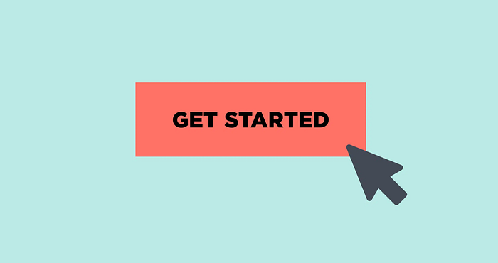
Click Me, Maybe?— The Art of Crafting the Perfect Call to Action Button
As a UI/UX designer, one of the most crucial aspects of my work is crafting the perfect call-to-action (CTA) button. It might seem like a small detail, but the CTA button can make all the difference in whether or not a user clicks through to your intended destination. That’s why I want to explore the art of crafting the perfect CTA button and how it can make a huge impact on your user experience.

First and foremost, it’s important to understand the psychology behind CTAs. People are naturally wired to take action, but they need a clear and concise prompt to do so. CTAs provide users with direction and make it easier for them to take the next step. However, not all CTAs are created equal. In order to be effective, a CTA button must be eye-catching, concise, and placed in the right spot on your website or app.

One of the most important aspects of a CTA button is its design. The button should be visually distinct from the rest of the page and should stand out in terms of color, size, and shape. Generally, a contrasting color is used for the CTA button to make it stand out. However, it’s important to strike a balance between making the button visually distinct and ensuring that it still fits in with the overall design of your website or app.

Another important aspect of a CTA button is the copy. The text on the button should be concise and action-oriented. Use strong action verbs to create a sense of urgency and encourage users to take action. For example, instead of using “submit” as your CTA, use something like “get started” or “sign up now.” These phrases create a sense of urgency and give users a reason to click through to the next page.

Lastly, the placement of the CTA button is crucial. The button should be placed in a prominent position on the page, typically above the fold. This means that users should be able to see the CTA button without having to scroll down the page. Additionally, it’s a good idea to include multiple CTAs throughout the page to give users multiple opportunities to take action.

In summary, the art of crafting the perfect CTA button requires a combination of design, copy, and placement. By keeping these factors in mind, you can create a CTA button that grabs users’ attention, encourages them to take action, and improves your overall user experience.
If you’re interested in learning more about the world of UI/UX #design and want to start creating your own ideas, we invite you to join us. We’ve created a Calendly link that allows you to book a free consultation with me. During this consultation, we’ll discuss your interests, answer any questions you may have, and provide you with some guidance on how to get started in the field of UI/UX.
Simply click the link below to book your consultation: calendly.com/iahmedtk
